Exploratory Data Analysis Using Mondrian
The best single device for suggesting, and at times answering, questions beyond those originally posed is the graphical display. – John Wilder Tukey
Volanno is pushing the bounds of data analytics in transportation. We are on the cutting-edge of analyzing transportation data and have trained statisticians exploring this data. Volanno has a proprietary process for data analysis. One of the first steps is to plot the data. As transportation yields large amounts of data, we need a special tool to support initial explorations. For this exercise, the tool we selected over Tableau, Excel, or R is Mondrian. Mondrian is an open-source software that allows users to have multiple plots open simultaneously. Its user interface is easy for most users to master. The main innovation is that all points highlighted in any plot are highlighted in all plots. Data visualization experts call this connectivity linked brushing.
Linked Brushing
Linked brushing involves merging two data visualization techniques: linking and brushing. Linking plots means having multiple plots open but, unlike Excel, user interactions in one plot are communicated to all other plots. When users brush a plot, they are able to subset the data by dragging the mouse. Linked brushing combines both of these: users can select data in one plot and this data is highlighted in all other plots (Ward M.O., 2009).
Real World Use
We are using Mondrian to find better estimates of arrival times when 100 miles remain to fly at Hartsfield-Jackson Atlanta International Airport (ATL). At this distance from the airport, air traffic controllers estimate an arrival time for a plane and designate a runway.
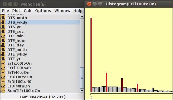
First, we queried all FAA arrivals at ATL in 2017. Figure 1 is a histogram of the errors in estimated arrival times. This histogram shows a truncated right-skewed Normal Distribution with some inflated values. We needed to further explore the inflated values (in red on Figure 1), and the lack of negative values that results in a truncation of the distribution. The truncation is the result of limitations placed on the data (must be non-negative).
To address the inflated values, we brushed them, which caused the points to be highlighted in red. To find the bounds of the bins in Mondrian, we hovered over the bins. The first red bin had bounds [0, 5), the second [60, 65), and the third [120, 125). The red bins represent flights where the error in the estimated arrival time (from 100 miles away from the airport) is 0 seconds, 60 seconds, 120 seconds, and so forth. These red bins are flights where the estimates for the arrival times are off by an exact number of minutes and 0 seconds (0 minutes, 1 minute, 2 minutes, 3 minutes, etc.). After recognizing this, we focused on finding reasons that a high number of flights had errors in minutes.
Our first example of linking can be seen on the bottom left side of Figure 1, where Mondrian shows that out of 428,541 flights () are highlighted in red in the histogram on the right side. As we brushed the plot on the right, Mondrian provides this percentage on the bottom left.

Figure 1: The Mondrian interface is shown on the left, and a histogram of the distributions of errors is shown on the right.
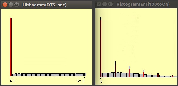
Figure 2 shows a simultaneous view of two histograms in Mondrian. The left histogram shows the seconds-component from the air traffic controllers’ prediction of when the flight will land at ATL, from 100 miles away. The right histogram shows the error in the estimated arrival time, from the same distance. After we brushed the zeroes in the left histogram, Mondrian highlighted (in red) the corresponding errors for those flights in the right histogram. This is linked brushing.
By plotting other variables to discern patterns against the errors in estimated arrival time, we found that the landing predictions also had a highly unusual zero-inflated Uniform Distribution (left histogram). The inflated values (in red) in the right histogram are due to the rounding of the predicted arrival times in the left histogram. We would expect some flights to have minute-errors and those bins still have grey portions. If air traffic controllers stopped rounding arrival times to the nearest minute, they can smooth out the inflated values.

Figure 2: The right histogram shows the seconds of the predicted landing time. The left histogram shows the prediction error from 100 miles away to landing. The zero-inflation in the left plot accounts for the inflated values in the right plot.
Why Mondrian?
Mondrian makes Linked Brushing easy for users. Linked Brushing in Mondrian is “one of the most powerful interactive tools for doing exploratory data analysis using visualizations” (Ward M.O., 2009). Mondrian also provides an extensive reference card under the help menu and video tutorials that are available for all users on the web. If you use R, an increasingly popular programming language, Mondrian can import data directly from an R session using commands found on the website. Other data can be imported following Mondrian’s import criteria (which excludes the usage of commas and spaces). In addition to Linked Brushing, Mondrian can produce parallel coordinate plots, scatter plot matrices (SPLOMs), mosaic and missing value plots, maps, and many other innovative and easy-to-use visualization techniques.
Stay tuned for more blog posts and news from Volanno’s data science team.
About Volanno
Founded in 2003, Volanno Inc., is an award-winning, Women-Owned Small Business (WOSB) based in Washington, DC providing software development, data analytics, project management, and technology implementation services to the transportation industry and beyond.
Reference: Ward M.O. (2009) Linking and Brushing. In: LIU L., ÖZSU M.T. (eds) Encyclopedia of Database Systems. Springer, Boston, MA


