Delivering Tableau Interactive Visualizations for the FAA
Evolution of Data Visualization at the FAA
The Federal Aviation Administration (FAA) relies on a large amount of data to operate the National Airspace System (NAS) efficiently. Several analytical teams within the organization are employed to run complex analysis to help FAA executives and other stakeholders make informed decisions. This is an extremely complex process that requires the analysis of hundreds of variables from multiple data sources such as the Traffic Flow Management System (TFMS) and the National Traffic Management Log (NTML). Such a complex endeavor requires a simple and elegant visual representation that is immediately comprehensible by the FAA’s wide range of stakeholders.
Up until recently, Microsoft Excel and PowerPoint were the primary means of data visualization, supported by other custom applications to allow users to conduct further analysis or to generate charts and graphs. Data visualization was a cumbersome process, with very little flexibility and few output options. In November 2017, the FAA asked Volanno to use Tableau to help represent Air Traffic Performance metrics more clearly and efficiently.
Project Goal
Volanno was tasked with developing interactive dashboards in Tableau that would provide a drill-down view of key air traffic metrics to assist management personnel in decision-making for the National Airspace System (NAS).
Agile Approach
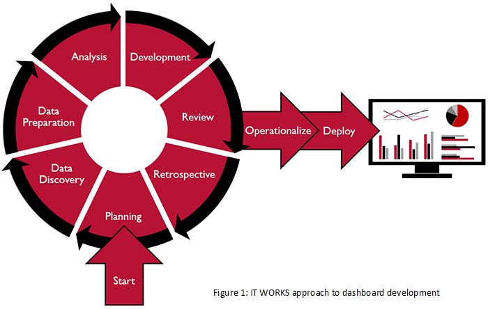
Volanno leveraged Agile methodology to take general client needs such as, “We need to show the number of operations by airport,” and develop flexible and interactive data visualizations. This process required many steps, which are detailed below.

Planning Phase
In this phase, we recorded requests such as, “We need to show the delays by day by airports and also show their deviation from a seasonal average.” Such requests were a good start, but did not specify the variables at play, such as the type of delays, data origin, dashboard visualization format, and user type, as well as what the story we were trying to tell was, and how the end users would then leverage this information.
Data Discovery: Understanding of the Data
As requirements became more specific, we began the crucial phase of Data Discovery, in which we talked to subject matter experts and database specialists and delved into the tables to research and refine the data required to build the visualization. When data is pulled from different data sources, metrics can have different definitions depending on each source’s criteria, and therefore may result in different aggregated metrics. We analyzed all data to make sure definitions were consistent.
Data Preparation: Consolidating the Data
During Data Preparation, we organized and consolidated data for visualization, aggregating data at a certain level or grouping them by a specific variable. This step often requires additional, complex calculations within the visualization or via SQL in the data source itself, which can have a significant impact on the performance and maintainability of the dashboard. We evaluated all options carefully.
Analysis: Selecting Visuals for Effective Storytelling
In the Analysis stage, Volanno usually implements an iterative approach to carefully select an elegant and engaging visual that can convey the intended story effectively.
Today’s data visualization tools allow for an almost infinite number of visualizations by leveraging multiple elements such as rows, columns, color, and shape. While many variations are possible, we are always careful to identify and rely only on the elements that truly contribute to the overall story and that are most appropriate for the culture and needs of our clients. Only then we operationalize the dashboard by optimizing the backend and making it production-ready. We also use SharePoint to implement additional features that would otherwise require a workaround in Tableau, potentially introducing complexities in Tableau workbooks and their maintenance.

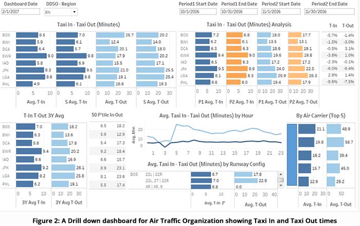
In the FAA project, we found that traditional but well-organized bar charts and line graphs conveyed the story more clearly than complex visuals. Figure 2 is an example of one of the early dashboards we designed for the FAA, which included mostly bar charts. The aim of this dashboard was to provide users support and additional information to perform secondary analysis of an issue. The top left of the dashboard provides summary information, and the bottom right expands the insight with detailed information.
Informational vs. Actionable Dashboards
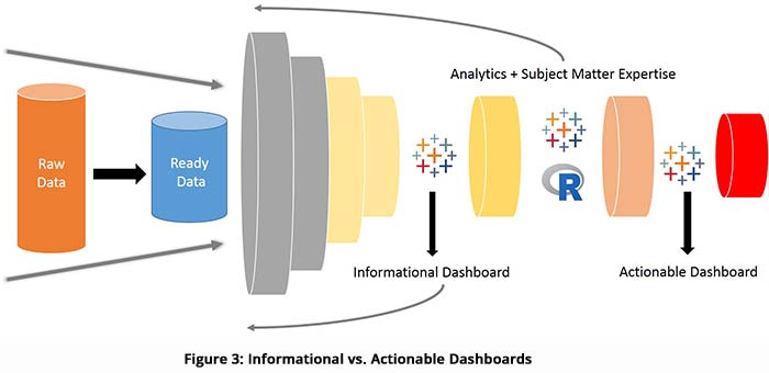
Informational dashboards typically provides the user with raw data. An actionable dashboard, on the other hand, requires that the user applies subject matter expertise and data analysis prior to visualization. An actionable dashboard is precise and provides only the information the user needs to take action. Data visualization tools such as Tableau allow integration of analytical packages including R and Python to perform basic and complex statistical analysis, as well as predictive analysis by applying machine learning algorithms. This way, raw information becomes actionable knowledge.

The Final Product
In the Deployment phase, we deployed the final visualization throughout the client’s organization using the most appropriate channel. Deploying visualizations to a SharePoint portal allows all internal users to interact with the dashboard and download PDFs, images, and data exports for further analysis.
Summary
Since 2017, Volanno has developed multiple dashboards for the FAA. Our team also implemented a distribution strategy and took Tableau and SharePoint to the next level by implementing embedded analytics.
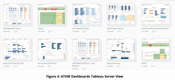
FAA users needed specific, actionable data insights on a next-day frequency, so most of the dashboards we delivered update early in the morning and provide summary reports. A portal called “Air Traffic Operations Metrics” (ATOM) contains all dashboards and visualizations related to Air Traffic Organization at the FAA. We have also implemented the ability to combine multiple days’ dashboards into a single file and email it to users, leading to less inbox clutter. We have automated the publication and distribution of PDF reports using Tableau Server. By using Tableau Server Tabcmd scripting, we are able to update extracts, create PDF reports, and email them to a distribution list every morning.


